Composition I
By now you would have noticed that when I discuss your paintings or any other painting with you, I talk about composition a lot. In fact, composition is the first thing I examine when I look at a painting.
The dictionary defines COMPOSITION as ‘the arrangement of elements within a work of art’. So, it is about how you arrange the elements you wish to present or work with within the two or three-dimensional space you have selected. When it comes to paintings, all you have to do is to place all the elements in your painting in the right spot and in the right way so they look pleasing to the eye.
What do we mean by the elements? Elements include shapes/objects, colours and textures. Each painting will have those three elements present in it, and if you position your shapes and objects, balance your colours and select your textures (or lack of), you will be able to set the mood and energy that will draw people in to your artwork again and again. Many of you probably take these decisions intuitively but will that happen for you every time or are you just lucky sometimes?
There are rules to help you get it right every time. Just remember – the rules are great but they are there to be challenged sometimes. They are a point of reference for us and while you are learning they are certainly very useful. So, lets quickly look at where these rules came from…
Ancient Greeks, Egyptians, Persians, Romans and other cultures from all over the world have created beautifully balanced and harmonious pieces of art and architecture by observing proportions in the most elegant forms created by nature and describing those with the help of mathematics in architecture. Through this careful observation, our ancestors have derived that the recipe for harmony and beauty includes the key ingredient of the GOLDEN RATIO (or the DEVINE PROPORTION). It has been used by Michelangelo and Leonardo Da Vinci and probably by all artists.
There is a harmonious relationship between unequal parts of a whole. This relationship repeats in nature and in the human body as well.
1.0 as to 1.618
in percentage (%) it is 61.8% to 100%
≈

Confusing?
To make this simpler lets approximate by starting with a division into thirds as they are portions of 33.33% and two thirds are 66.667% which is a close approximation to the golden ration of 61.8%.
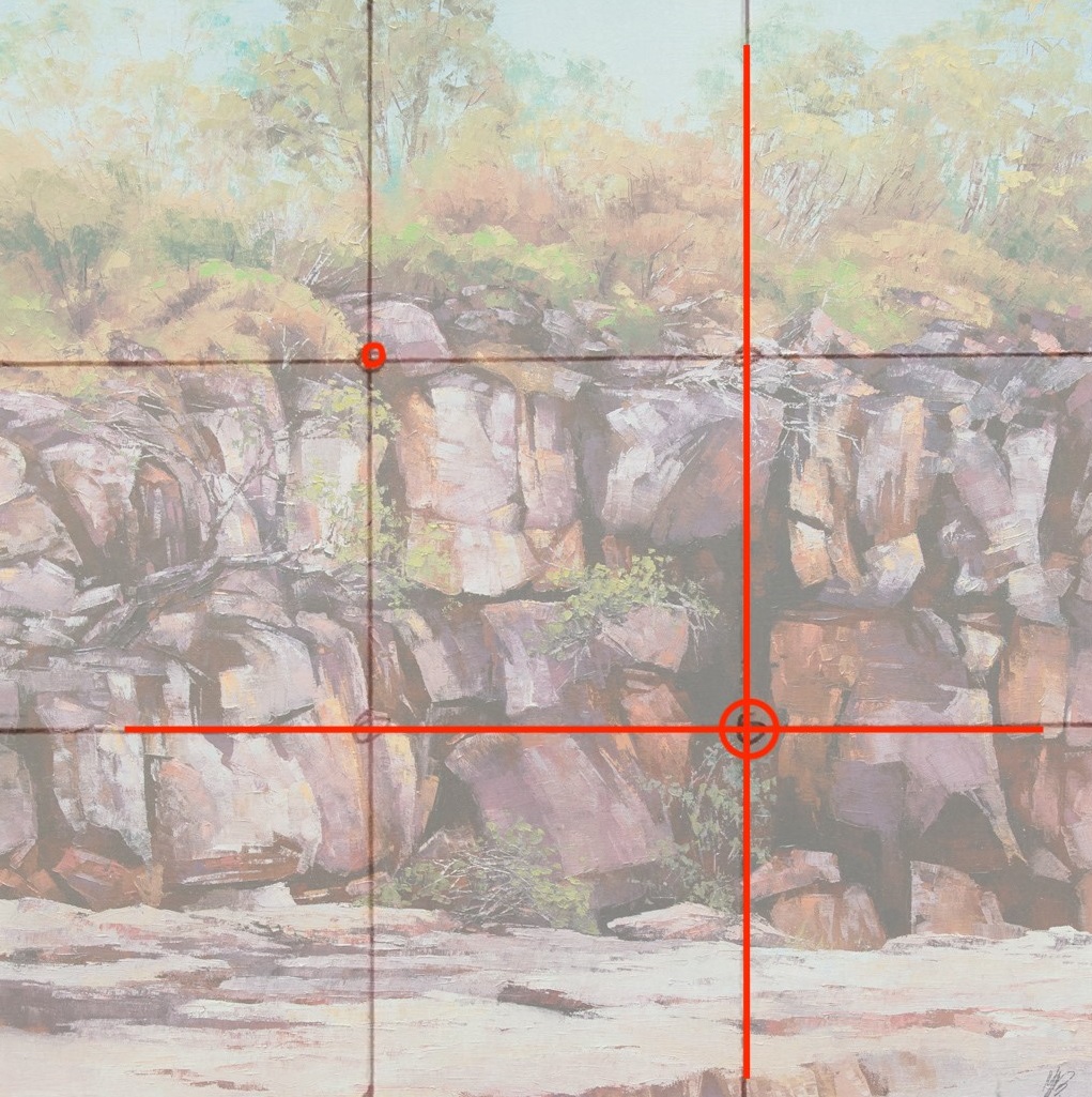
First and foremost, understand what is important in your painting, where do you like people to look, what do you want them to notice the most. To place the object/shape of importance in the right place use the Rule of Thirds and offset it with a smaller shape preferably around the other diagonal crossing to create a relationship. I call this an uneven balance! In other words it is a deliberate imbalance that creates tension and therefore attracts interest.
Lets look at the examples:

Placing your objects of interest in the golden points will create a more pleasing and interesting composition.
On the other hand, what almost certainly make your painting dull and boring or even uncomfortable to look at (unless you compensate for a boring composition with colours, textures and great drawing skills!), is placing images in the centre or dividing your composition in half vertically, horizontally or diagonally as per below image.

So, start applying these rules to your paintings as soon as possible. Even though you may be using reference materials, start with creating your own imaginary composition. I do recommend drawing several small thumbnail sketches first. Any size of canvas, paper or board can be divided vertically and horizontally into equal thirds and can be used to then transfer the elements of your composition in the right places for a final adjustment.

And go to the next page for some tips!
Here is a quick checklist to consider at the start and when working on your painting:
Corners lead the eye out of the picture. Redirect the eye away from those exits.
Don’t emphasize the edges of the painting.
Don’t cut the picture into equal proportions.
Choose one vertical and one horizontal golden line and guide the composition alongside of them.
Use the cross (golden cross) of these lines to place your focal point on and balance by placing smaller shape diagonally across around the golden point.
Don’t use repetitive distances between the shapes.
Use contrast in shapes (big & small, thick & thin, tall & short) and tones (light & dark) to ensure a harmonious whole.
Emphasize the focal point of the painting around the golden points.
Don’t place any object so it touches the side of canvas and don’t run any sharp lines through the corners.
Select or deselect the objects you like to have in your painting.
Next week we will talk about Dynamic Symmetry and more complex compositions.